OBSESSED WITH HAMBONE
OBJECTIVE
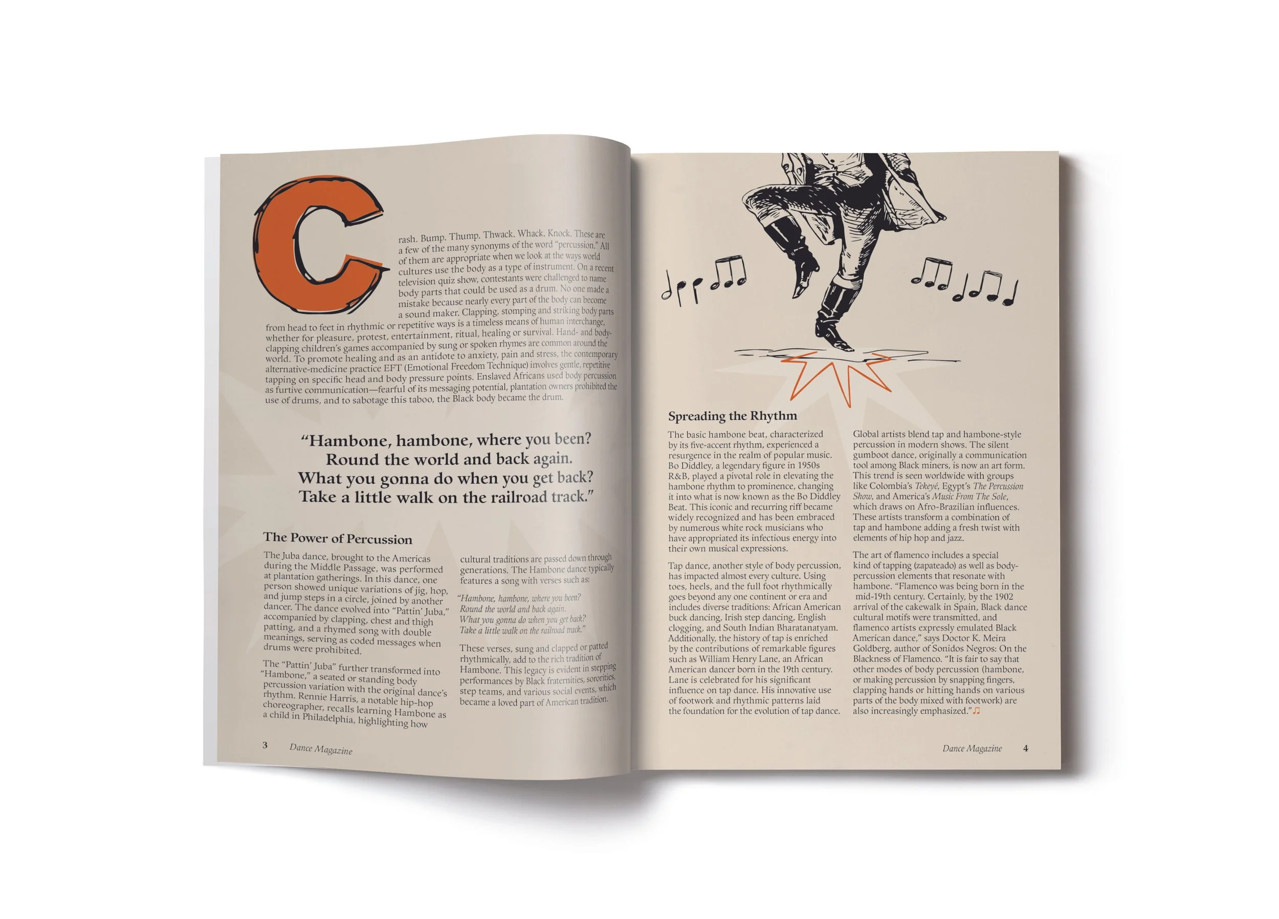
The project required the development of two feature article spreads for Dance magazine. The article discusses the origins and influences of Hambone.
APPROACH
In Dance Magazine, the feature article “Obsessed with Hambone” vividly captures the essence of this rhythmic art form through a dynamic blend of design elements. The typography, combining manipulated Arial Black with the serif Guardi LT Std, mirrors the bold beats of hamboning against a backdrop of tan, accented with bursts of orange. However, it’s the hand-drawn elements adorned with clapping sound bursts that truly enliven the spread, infusing it with the raw, organic essence of hamboning and inviting readers to experience its infectious rhythm firsthand. Through its presentation, the article immerses readers in the vibrant world of hamboning, offering a glimpse into its cultural heritage and rhythmic intricacies.


